

Hailey Sarnecki
/
Graphic Designer
*This is a project created from my college career at SCAD*
AMERICAN BEE JOURNAL
The American Bee Journal is a magazine that has been around since 1861. This magazine is to inspire anyone who is interested in learning everything there is to know about bees and being a beekeeper. As this magazine enters the modern day, I wanted to do a redesign of their cover and their main article of the issue (May 2019).
When approaching a magazine that has been around for well over 100 years, I made sure to keep it respectful and mature for those who have been longterm subscribers. I kept the title as a thin, classic feeling serif (Cochin), but used san serifs (Montserrat and Gill Sans) to add a modern feel that would attract a younger audience to pick this magazine up. Using a sans serif felt much lighter and more legible for how text-heavy and informative this article was.
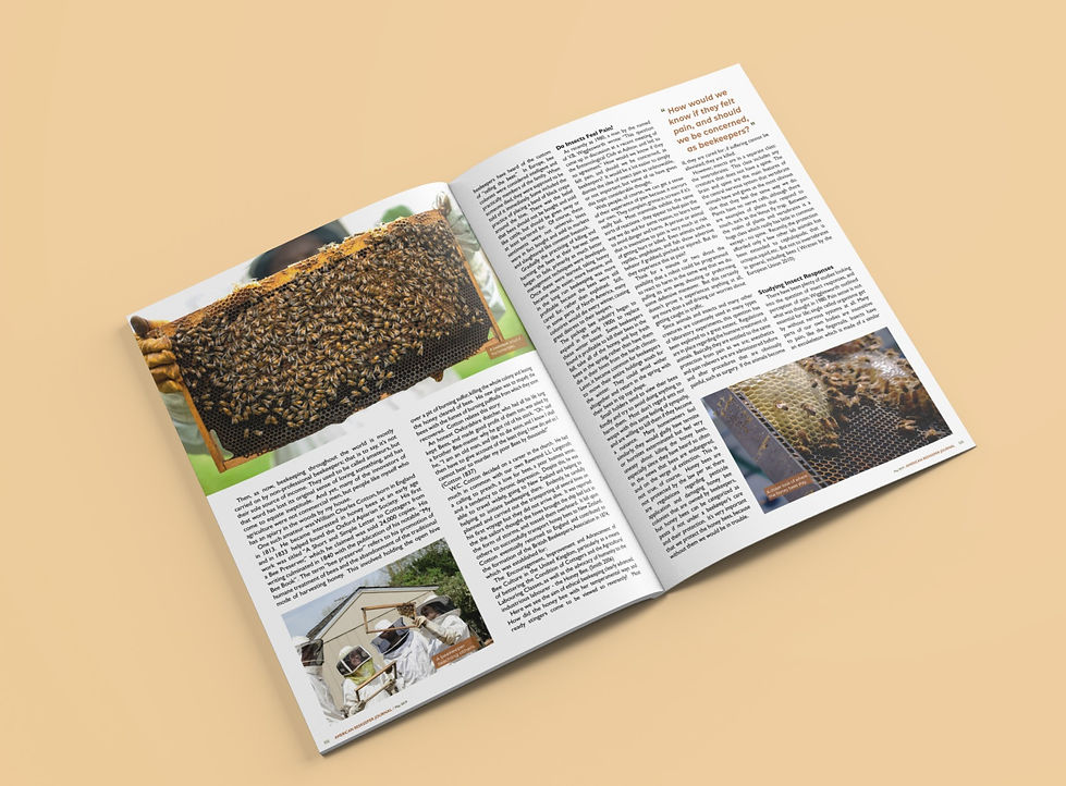
I added in photographs (from Unsplash) of bees and beekeepers to break up the text, but to also give a visual of what the article was talking about. The photos were edited to allude warmth and give off a natural and cohesive feeling throughout, and those colors were color-dropped to use as accents for the graphics and text.


A closer look at the content.


The spreads in magazine format.