*This is a project created from my college career at SCAD*
ROOSTER REBRAND
This Small Brand Rebrand was inspired by a coffee shop I used to frequent in Hagerstown, MD. It's a locally owned coffee shop that is well-known amongst locals for its quality drinks and eclectic vibe inside. The goal of this rebrand wasn't to completely change its feeling, but to update it and give a modern flare to draw in a younger crowd while still appealing to the older and loyal consumers that have been around from the beginning.
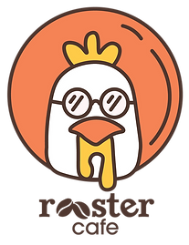
To develop a new identity while maintaining its integrity, I chose to use a slab serif font for the title and a sans serif for the subtitle. A slab serif is classic, but not as serious as a serif, and the sans serif is modern, so mixing the two will help feel the same as its original, while still being approachable and less stiff. I replaced the double O's with coffee beans, since I changed its original name of coffeehouse to cafe. I made the colors scheme bright and natural to better match the brand's original identity and to give off a more welcoming and bright feeling compared to the darker colors used before. For the logo itself, I felt it was a great opportunity to tie in the name to an icon that they can be known for with their advertising. Having a vector illustration of a rooster in a moon wearing some shades is a simple, yet memorable icon that can be shown with little context will help them stand out and make marketing easier.
To show what the branding would look like, I created some mock-ups of what their new packaging would look like for their to-go orders, as well as a physical menu to take with you, since their only menu is a chalkboard above their register. I updated what their shirts would look like, and added a branded tote bag since they are a popular accessory amongst the younger crowds.
Rooster is very active on social media, specifically Instagram, so I created what their profile page would look like with their new branding, as well as a 2-slide post promoting their new branding. The way it's being promoted is how they have promoted previous new items/events on their page before, so I made sure it wasn't going to stray away from their usual business practice, and won't financially impact them in any extreme way.


The logo variations.

Brand identity.


How the branding would look in action.


Retail.

Social media marketing.


